One aspect of global inequality has to do with land-- who has access and can use it. As inequality widens and with growing concerns about population growth, some countries are increasingly buying, renting, or otherwise taking some form of ownership over the land of other countries. Have a look at this website to see which countries are doing what to what countries. Why do you think this is so important?
Visit the full Land Matrix site.
Monday, February 23, 2015
Saturday, February 14, 2015
animation of European Colonization 15th to 20th Century
I continue to be grateful and humbled by all the great stuff people are willing to share.
Wednesday, February 11, 2015
Lesson Plan - Day 05
I've added a lot of posts. Here's how to go through them.
Status/size of world population
Historical World Population Growth & Demographic Transition
Importance of Age Pyramids
Status/size of world population
- World Clock
- Worldmapper view of the world and population who live on less that $1/day to over $200/day
Historical World Population Growth & Demographic Transition
Importance of Age Pyramids
Age or Population Pyramids
From Wikipedia:

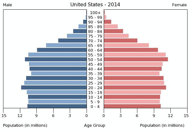
The images below come from PopulationPyramids.net; visit the site to view pyramids from other countries.


A population pyramid, also called an age pyramid or age picture diagram, is a graphical illustration that shows the distribution of various age groups in a population (typically that of a country or region of the world), which forms the shape of a pyramid when the population is growing.[1] It is also used in ecology to determine the overall age distribution of a population; an indication of the reproductive capabilities and likelihood of the continuation of a species. (from Wikipedia)A clearer view of age of pyramid for the USA
The images below come from PopulationPyramids.net; visit the site to view pyramids from other countries.
world population growth & demographic transition
Population Growth over time
Demographic Transition Model
Highlights in World Population Growth
Some Mortality Tables for USA

Measles
TB

Demographic Transition Model
Highlights in World Population Growth
Some Mortality Tables for USA
Measles
TB
the importance of geography, population growth - great post from Benjamin Hennig
A great post by Benjamin Hennig on population growth, geography, and sustainability. Hennig writes
Geography matters because where populations increase and where they decline is highly relevant for finding solutions that provide a better future for all of humanity. While we are already producing enough food for 10 billion people, as shown in a study published in Nature, we do not manage to distribute this fairly so that hunger is a persisting problem. A population of 9, 10 or even 11 billion does not have to be a disaster if humanity makes more effort to minimise its environmental impact while providing a sustainable basis for how many people there are in the world.Meanwhile, here's an animation of the world sized by people living on less than $1/day to those earning over $200/day from Worldmapper (© Copyright 2006 SASI Group (University of Sheffield) and Mark Newman (University of Michigan)). (note that the animation below is in Flash)
Monday, February 9, 2015
Saturday, February 7, 2015
data visualization with Google!
Have a look at Google's Public Data Explorer that allows you to visualize and a great deal of public data.
Here are some interesting charts.
Now you might want to go to the same sight and search for GDP per capita to se the difference.
Here are some interesting charts.
Now you might want to go to the same sight and search for GDP per capita to se the difference.
Sunday, February 1, 2015
how to change your username in Google Groups
It's actually quite easy to change your name in Google Groups. Here's how in just a few simple steps.
1) Log into Google Group
2) in the upper right, click My Settings


1) Log into Google Group
2) in the upper right, click My Settings
3) Choose "Membership and email settings
4) In the pop up window, give yourself a name that is easily recognizable; you may also choose to link your name with your Google Profile.
5) when you're done, click "Save" and that's it.
Subscribe to:
Posts (Atom)